Image 1 of 6
 Image 2 of 6
 Image 3 of 6
 Image 4 of 6
 Image 5 of 6
 Image 6 of 6
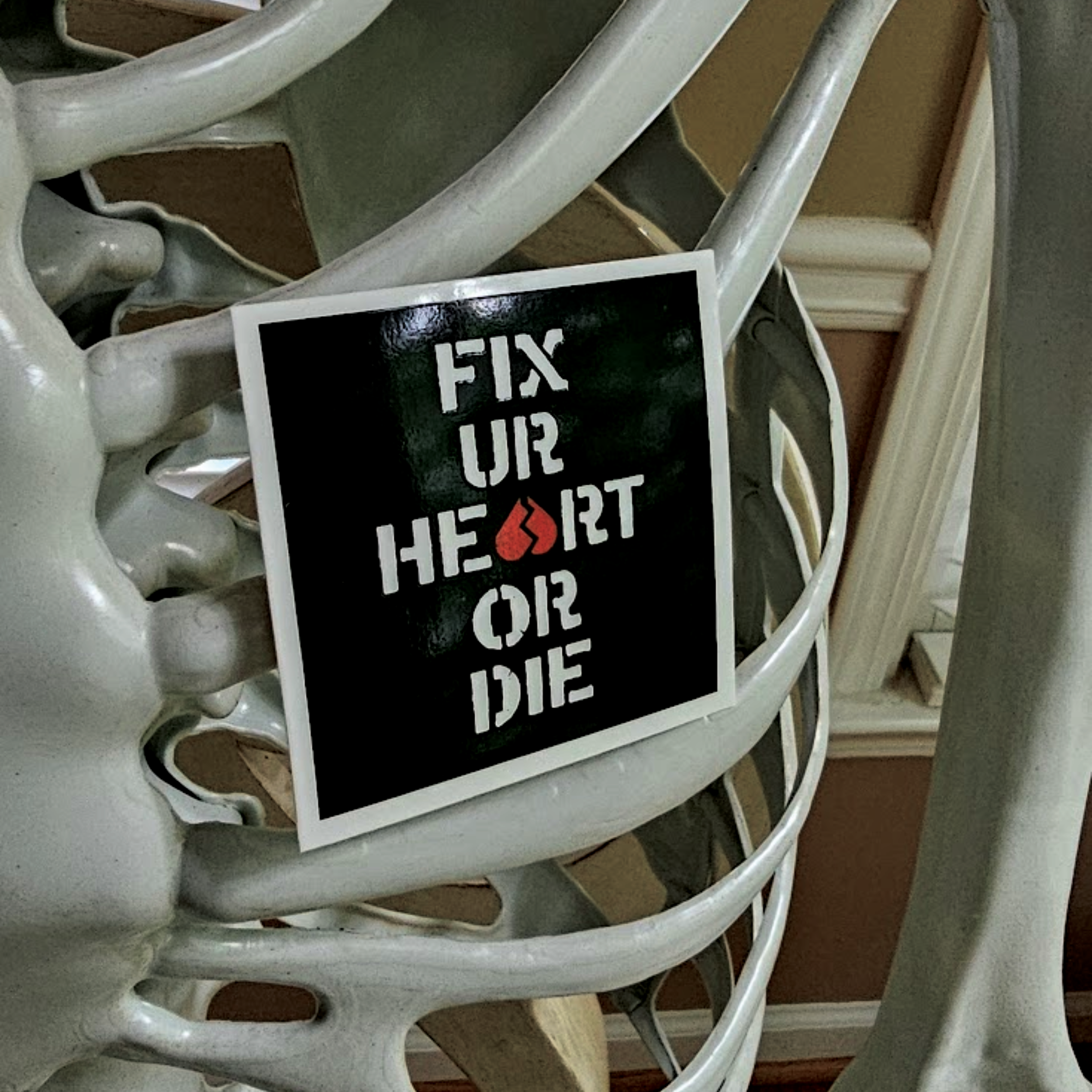
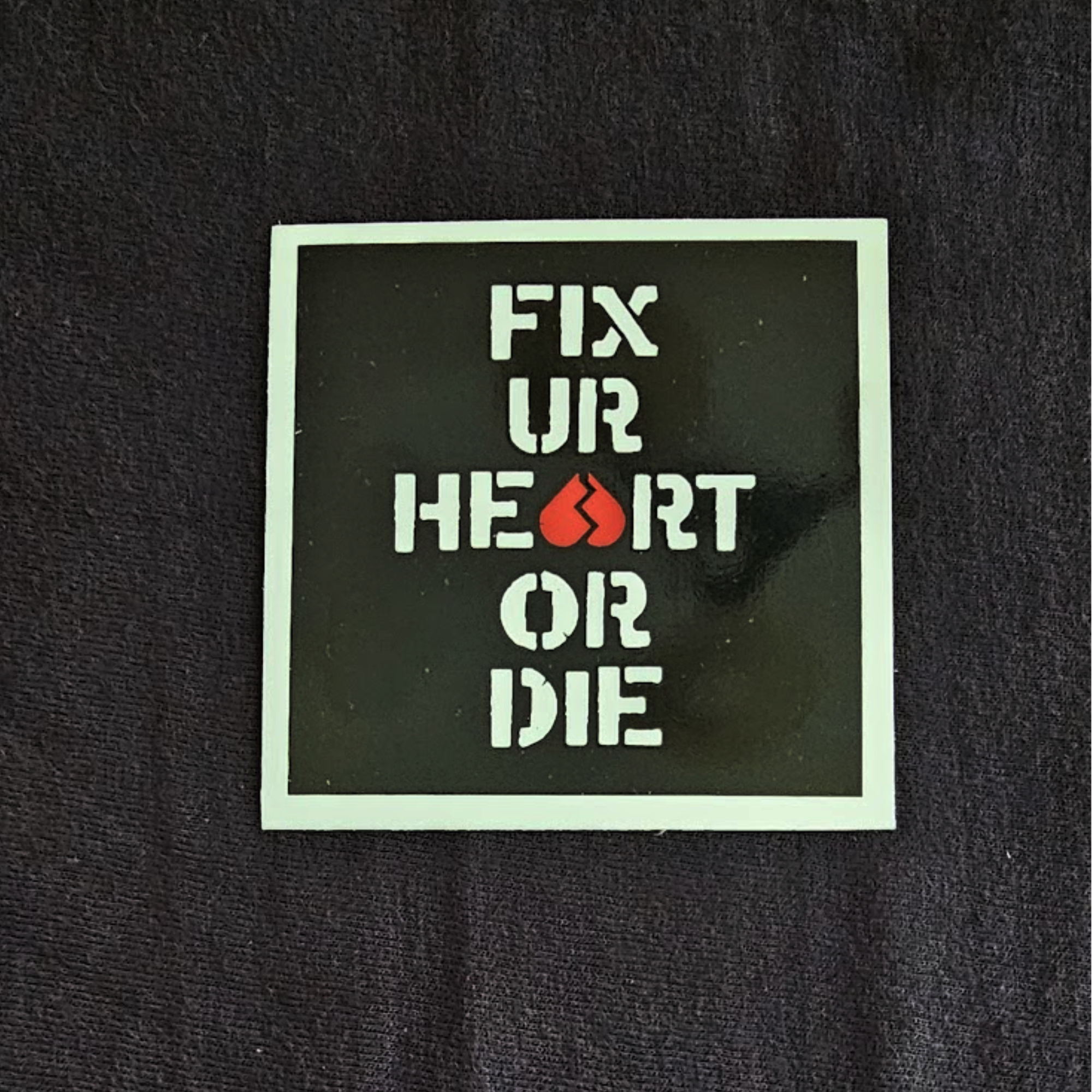
Went through a few revisions on this one, starting from something that was more handwritten and freeform and eventually landing on something that was more simplistic and readable, while further emphasizing the main design element— the broken upside-down heart forming the A in Heart. I think the other versions had merit, but ultimately I wanted something that was less like a screed and more like a mandate. Like a sign you might see as you travel the wrong way down a lost highway, urging you to turn things around.